Please click the link below to download the latest version of node.js.
After you have completed the installation of node.js, you can install Gulp using the following command.
npm install -g gulp
[Urushi-ROOT]/util/node/gulp
cd [Urushi-ROOT]/util/node/gulp
By running the following command, all dependent packages will be installed.
npm install
The following command will run gulp task.
gulp scss-build
Please check if the following file is created.
[Urushi-ROOT]/urushi/material/style/material.css
Make sure the set the document root for the HTTP server to [Urushi-ROOT].
Once the HTTP server has started, check if the test page is working.
If you can see the following page on your browser, you have successfully installed Urushi!
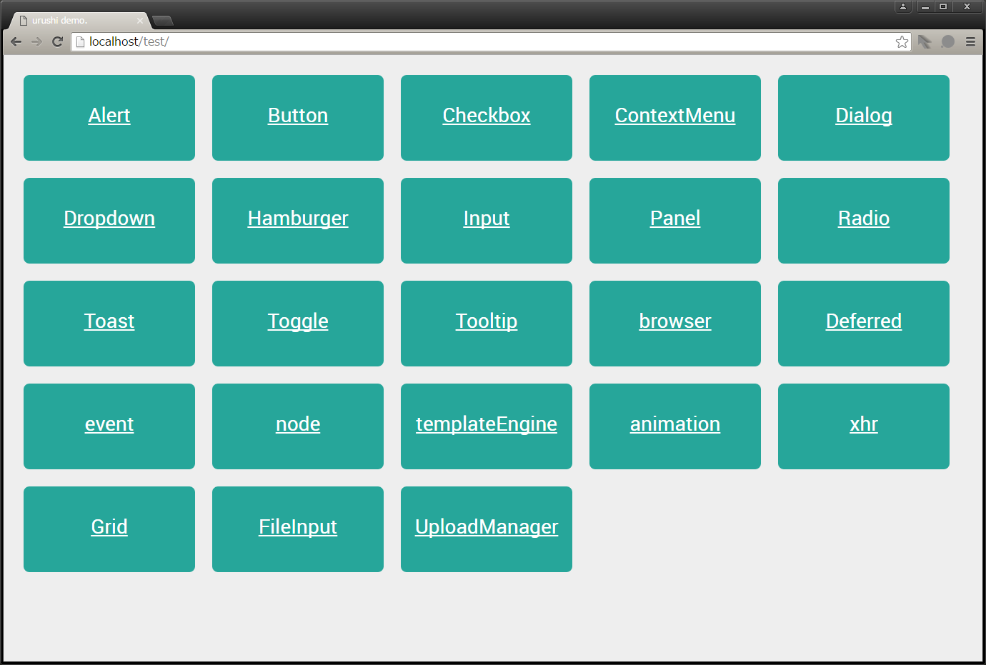
Feel free to press the Button component or any button while you are at it!
Let's create your own component using Urushi.
First, try creating a card component like the one below.
Add the path of card component to requireConfig.js file.
Please add the following code to requireConfig.js file.
// requireConfig.js
window.requireConfig = {
    baseUrl : window.requireRoot || './',
    paths : {
        text : 'lib/js/text',
        //・・・
        uploadManagerListItemTemplate : 'urushi/beta/template/uploadManagerListItem.html',

        // Card
        Card : 'urushi/material/js/Card',
        cardTemplate : 'urushi/material/template/card.html'
    },
    shim : {
    //・・・
Add card component information to the template engine config file.
Please add the following source code to the templateConfig.js file.
// templateConfig.js
define(
    'templateConfig',
    [],
    /**
     * @alias module:templateConfig
     * @returns {object} templateConfig object.
     */
    function () {
        'use strict';

        return {
            base : {
                //・・・
            },

            //・・・

            card : {
                name : 'Card',
                className : 'card',
                requires : [],
                method : {
                    id : 'getField',
                    cardClass : 'getOptionalClasses',
                    title : 'getUrushiOption',
                    titleImg : 'getUrushiOption',
                    content : 'getChildNodesFunction'
                },
                options : {
                    id : 'id'
                }
            }
        };
    }
);
Refer to the following link to learn more about template config writing.
how to write templateConfig
First, create the HTML file that will be used as template for card component.
After you have created new card.html file, write the following code in the file.
<!-- card.html -->
<div id="<%= id %>" class="card shadow-z-3 <%= cardClass %> <%= additionalClass %>">
    <div id="<%= id %>-img" class="card-img">>
        <div>
            <img src="<%= titleImg %>">
        </div>
    </div>
    <div id="<%= id %>-title" class="card-title">
        <span><%= title %></span>
    </div>
    <div id="<%= id %>-content" class="card-content"><%= content %></div>
</div>
Card component class is defined using JavaScript.
So you need to create new Card.js file and add the following source to the file.
// Card.js
/**
 * Provides card class as widget.
 */
define(
    'Card',
    [
        'Urushi',
        'Base',
        'text!cardTemplate'
    ],
    /**
     * @class
     * @augments module:_Base
     * @alias module:Card
     * @returns {object} Card instance.
     */
    function (urushi, Base, template) {
        'use strict';

        var CONSTANTS = {
            ID_PREFIX : 'urushi.Card',
            EMBEDDED : {cardClass : '', additionalClass : '', title : '', content : '', titleImg : ''}
        };

        var idNo = 0;

        return Base.extend(/** @lends module:Card.prototype */ {

            template : undefined,
            embedded : undefined,
            _initProperties : function (/* object */ args) {
                this.template = template;
                this.embedded = CONSTANTS.EMBEDDED;
            },
            initOption : function (/* object */ args) {
                this.setContent(args.content);
            },
            setContent : function (/* string|node|NodeList|function */ contents) {
                if ('function' === typeof contents) {
                    contents = contents();
                }
                if (!urushi.setDomContents(this.contentNode, contents)) {
                    urushi.clearDomContents(this.contentNode);
                }
            },
            _attachNode : function () {
                this.imgNode = this.rootNode.getElementsByClassName('card-img')[0];
                this.titleNode = this.rootNode.getElementsByClassName('card-title')[0];
                this.contentNode = this.rootNode.getElementsByClassName('card-content')[0];
            },
            _getId : function () {
                return CONSTANTS.ID_PREFIX + idNo++;
            }
        });
    }
);
That's all to create a component.
Next we need to style the component.
Create a CSS file specifically for card component.
Add the following code for your new created card.css file.
.card
.shadow-z-1{box-shadow:0 1px 3px rgba(0,0,0,.12),0 1px 2px rgba(0,0,0,.24)}
.shadow-z-2{box-shadow:0 3px 6px rgba(0,0,0,.16),0 3px 6px rgba(0,0,0,.23)}
.shadow-z-2-hover{box-shadow:0 3px 6px rgba(0,0,0,.2),0 3px 6px rgba(0,0,0,.28)}
.shadow-z-3{box-shadow:0 10px 20px rgba(0,0,0,.19),0 6px 6px rgba(0,0,0,.23)}
.shadow-z-4{box-shadow:0 14px 28px rgba(0,0,0,.25),0 10px 10px rgba(0,0,0,.22)}
.shadow-z-5{box-shadow:0 19px 38px rgba(0,0,0,.3),0 15px 12px rgba(0,0,0,.22)}
.card{border-radius:2px;border:0;background-color:#FFF;margin: 15px;}
.card {max-width: 512px;}
.card-img:before {padding-top: 56.25%;display: block;content: "";}
.card-img {position: relative;}
.card-img > div {position: absolute;top: 0px;left: 0px;bottom: 0px;right: 0px;}
.card-img > div > img {max-width: 1024px;width: 100%;height: 100%;}
.card .card-title {padding: 24px 16px 16px 16px;font-size: 24px;}
.card .card-content {padding: 24px 16px 16px 16px;font-size: 16px;}
Let's use the created component.
get started
Please refer to get started to learn more about the installation of Urushi in web site.
Please set the background image path to the titleImg of data-urushi-options.
In the example below, sample.png is placed in the same directory as index.html.
<!-- index.html -->
<!DOCTYPE html>
<html>
<head>
    <meta charset="utf8">
    <link href="./urushi/material/style/material.css" rel="stylesheet">
    <link href="./urushi/material/style/module/structure/card.css" rel="stylesheet">

    <script src="./config/requireConfig.js"></script>
    <script src="./lib/js/require.js" data-main="./main"></script>
</head>
<body>
    <div class="test-area">
	    <div data-urushi-type="card" data-urushi-options='{"title" : "card-title" ,  "titleImg" : "sample.png"}'>
		    <div>Card Content</div>
	    </div>
	    <div data-urushi-type="card" data-urushi-options='{"title" : "card-title"}'>
		    <div>Card Content</div>
	    </div>
    </div>
</body>
</html>
Let's check out the preview! If the component was correctly created, you can see the following in your page preview.