以下の「GET NODE.JS」を押下して、
以下のリンクからnode.jsをダウンロードしてください。
以下のコマンドを実行し、Gulpをインストールしてください。
npm install -g gulp
[Urushi-ROOT]/util/node/gulpに移動してください。
cd [Urushi-ROOT]/util/node/gulp
以下のコマンドを実行し、パッケージをインストールしてください。
npm install
以下のコマンドを実行し、Gulpタスクを実行して下さい。
gulp scss-build
以下のファイルが生成されていることを確認して下さい。
[Urushi-ROOT]/urushi/material/style/material.css
HTTPサーバのドキュメントルートを [Urushi-ROOT] に設定してください。
HTTPサーバを起動したら、テストページを開いてみましょう。
以下のようなページが表示されれば正常に動作しています。
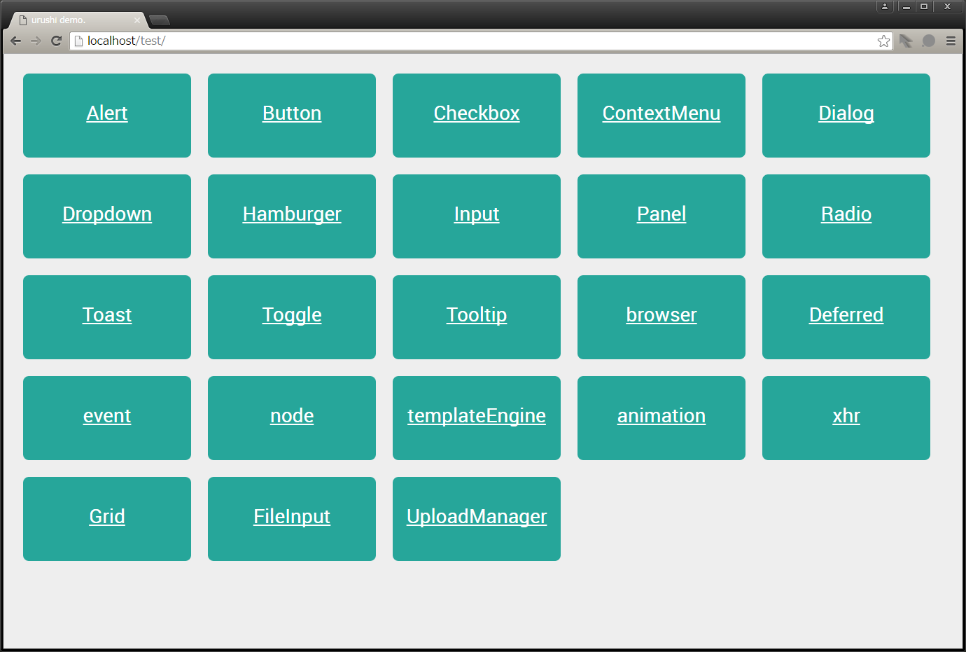
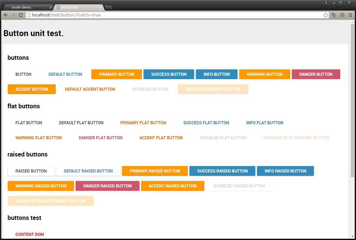
試しにButtonコンポーネントを見てみましょう。
Urushiをベースに、独自コンポーネントの作成を行います。
以下の様なCardコンポーネントを作成していきましょう。
CardコンポーネントのPATHを設定ファイルに追加します。
requireConfig.jsに以下のソースコードを記述してください。
// requireConfig.js
window.requireConfig = {
    baseUrl : window.requireRoot || './',
    paths : {
        text : 'lib/js/text',
        //・・・
        uploadManagerListItemTemplate : 'urushi/beta/template/uploadManagerListItem.html',

        // Card
        Card : 'urushi/material/js/Card',
        cardTemplate : 'urushi/material/template/card.html'
    },
    shim : {
    //・・・
Template engineの設定ファイルに、Cardコンポーネントの情報を追加します。
templateConfig.jsに以下のソースコードを記述してください。
// templateConfig.js
define(
    'templateConfig',
    [],
    /**
     * @alias module:templateConfig
     * @returns {object} templateConfig object.
     */
    function () {
        'use strict';

        return {
            base : {
                //・・・
            },

            //・・・

            card : {
                name : 'Card',
                className : 'card',
                requires : [],
                method : {
                    id : 'getField',
                    cardClass : 'getOptionalClasses',
                    title : 'getUrushiOption',
                    titleImg : 'getUrushiOption',
                    content : 'getChildNodesFunction'
                },
                options : {
                    id : 'id'
                }
            }
        };
    }
);
templateConfig.jsの記載方法については下記を参考にしてください。
how to write templateConfig
CardコンポーネントのテンプレートとなるHTMLファイルを作成します。
card.htmlを新規に作成し、以下のソースコードを記述してください。
<!-- card.html -->
<div id="<%= id %>" class="card shadow-z-3 <%= cardClass %> <%= additionalClass %>">
    <div id="<%= id %>-img" class="card-img">>
        <div>
            <img src="<%= titleImg %>">
        </div>
    </div>
    <div id="<%= id %>-title" class="card-title">
        <span><%= title %></span>
    </div>
    <div id="<%= id %>-content" class="card-content"><%= content %></div>
</div>
CardコンポーネントクラスをJavaScriptで定義します。
Card.jsを新規に作成し、以下のソースコードを記述してください。
// Card.js
/**
 * Provides card class as widget.
 */
define(
    'Card',
    [
        'Urushi',
        'Base',
        'text!cardTemplate'
    ],
    /**
     * @class
     * @augments module:_Base
     * @alias module:Card
     * @returns {object} Card instance.
     */
    function (urushi, Base, template) {
        'use strict';

        var CONSTANTS = {
            ID_PREFIX : 'urushi.Card',
            EMBEDDED : {cardClass : '', additionalClass : '', title : '', content : '', titleImg : ''}
        };

        var idNo = 0;

        return Base.extend(/** @lends module:Card.prototype */ {

            template : undefined,
            embedded : undefined,
            _initProperties : function (/* object */ args) {
                this.template = template;
                this.embedded = CONSTANTS.EMBEDDED;
            },
            initOption : function (/* object */ args) {
                this.setContent(args.content);
            },
            setContent : function (/* string|node|NodeList|function */ contents) {
                if ('function' === typeof contents) {
                    contents = contents();
                }
                if (!urushi.setDomContents(this.contentNode, contents)) {
                    urushi.clearDomContents(this.contentNode);
                }
            },
            _attachNode : function () {
                this.imgNode = this.rootNode.getElementsByClassName('card-img')[0];
                this.titleNode = this.rootNode.getElementsByClassName('card-title')[0];
                this.contentNode = this.rootNode.getElementsByClassName('card-content')[0];
            },
            _getId : function () {
                return CONSTANTS.ID_PREFIX + idNo++;
            }
        });
    }
);
ここまでがコンポーネント作成で必要な作業です。
次はスタイルを整えていきます。
Cardコンポーネント専用のCSSファイルを作成します。
card.cssを新規に作成し、以下のソースコードを記述してください。
.card
.shadow-z-1{box-shadow:0 1px 3px rgba(0,0,0,.12),0 1px 2px rgba(0,0,0,.24)}
.shadow-z-2{box-shadow:0 3px 6px rgba(0,0,0,.16),0 3px 6px rgba(0,0,0,.23)}
.shadow-z-2-hover{box-shadow:0 3px 6px rgba(0,0,0,.2),0 3px 6px rgba(0,0,0,.28)}
.shadow-z-3{box-shadow:0 10px 20px rgba(0,0,0,.19),0 6px 6px rgba(0,0,0,.23)}
.shadow-z-4{box-shadow:0 14px 28px rgba(0,0,0,.25),0 10px 10px rgba(0,0,0,.22)}
.shadow-z-5{box-shadow:0 19px 38px rgba(0,0,0,.3),0 15px 12px rgba(0,0,0,.22)}
.card{border-radius:2px;border:0;background-color:#FFF;margin: 15px;}
.card {max-width: 512px;}
.card-img:before {padding-top: 56.25%;display: block;content: "";}
.card-img {position: relative;}
.card-img > div {position: absolute;top: 0px;left: 0px;bottom: 0px;right: 0px;}
.card-img > div > img {max-width: 1024px;width: 100%;height: 100%;}
.card .card-title {padding: 24px 16px 16px 16px;font-size: 24px;}
.card .card-content {padding: 24px 16px 16px 16px;font-size: 16px;}
作成したCardコンポーネントを利用してみましょう。
get started の「作成するWebサイトにUrushiを組み込む」を参考にします。
data-urushi-optionsの"titleImg"には、背景画像のパスを指定します。
下記の例では、index.htmlと同階層に配置したsample.pngを指定しています。
<!-- index.html -->
<!DOCTYPE html>
<html>
<head>
    <meta charset="utf8">
    <link href="./urushi/material/style/material.css" rel="stylesheet">
    <link href="./urushi/material/style/module/structure/card.css" rel="stylesheet">

    <script src="./config/requireConfig.js"></script>
    <script src="./lib/js/require.js" data-main="./main"></script>
</head>
<body>
    <div class="test-area">
	    <div data-urushi-type="card" data-urushi-options='{"title" : "card-title" ,  "titleImg" : "sample.png"}'>
		    <div>Card Content</div>
	    </div>
	    <div data-urushi-type="card" data-urushi-options='{"title" : "card-title"}'>
		    <div>Card Content</div>
	    </div>
    </div>
</body>
</html>
プレビューを確認してみましょう。正しく導入出来ていると以下のプレビューと同じようなプレビューを確認できます。